The Synergy Organization, Inc. gave approval today for DiPietro Marketing Group LLC, Synergy’s marketing agency, to unveil its new corporate identity. The culmination of the re-branding effort may be viewed at Synergy’s piece of online marketing communications, located at www.SynergyOrg.com.
Initial Request: Re-Design Our Website
Synergy is an executive healthcare recruiter. It is transforming that industry having practically invented the best practice of integrating evidence-based, objective metrics into the search, selection, development and retention of healthcare industry executive leadership talent.
It approached DMG for a website re-design. However, DMG realized immediately that Synergy’s website, stationary, collateral materials, proposals, etc. all lacked focus and cohesion in terms of a single, unified, meaningful message. Things were all over the place.
What messaging there was concentrated on explaining how Synergy does what it does. The message was that Synergy’s candidate search and selection process was based on scientific evidence. There was not much that communicated a message that would really help answer a prospect’s primary question: “Why should I be at all interested in whatever it is you do?”
Until the benefit was made perfectly clear, the how wouldn’t really matter to the Target Audience.
The Need For A Comprehensive Corporate Identity
Instead of starting with a re-design of the website, DMG recommended that first, a full evaluation of Synergy’s service offerings, their benefits, as well as messaging, and look and feel as well. In essence, Synergy’s entire identity needed review and analysis before proceeding with a website re-design.
This is what DMG discovered during its diagnosis of the situation:
![]() The why is that Synergy helps healthcare clients hire leaders who are the right fit, the first time.
The why is that Synergy helps healthcare clients hire leaders who are the right fit, the first time.
![]() This saves Synergy’s clients time, and money. It also helps increase profitability and productivity while reducing risks.
This saves Synergy’s clients time, and money. It also helps increase profitability and productivity while reducing risks.
![]() The how (scientific, evidence-based approach to candidate search and selection) involved a couple of steps:
The how (scientific, evidence-based approach to candidate search and selection) involved a couple of steps:
- Validation of whether it is a square or round hole Synergy’s client is trying to fill, and
- Of all of the round holes out there, which is the perfect fit and why?
![]() Synergy saw itself as transforming the healthcare recruiting industry due to its first-to-market scientific, objective, evidence-based approach. DMG believed conveying that “transforming” message was a must to help differentiate. In addition, Synergy wanted to visually say that it was contemporary as well as a major player in its vertical.
Synergy saw itself as transforming the healthcare recruiting industry due to its first-to-market scientific, objective, evidence-based approach. DMG believed conveying that “transforming” message was a must to help differentiate. In addition, Synergy wanted to visually say that it was contemporary as well as a major player in its vertical.
DMG’s Approach And Solutions
![]() Determine the company’s existing position in the marketplace.
Determine the company’s existing position in the marketplace.
![]() Assess all services offered to determine strengths and weaknesses relative to competitive offerings, including the likes of Korn Ferry.
Assess all services offered to determine strengths and weaknesses relative to competitive offerings, including the likes of Korn Ferry.
![]() Create a strategic position that would both differentiate from competitors and resonate with prospects. The primary task: determining, exactly, what the primary benefit of the client’s offerings is as perceived by the Target Audience. (It was determined that healthcare organizations want to be led and transformed by their executive leaders.)
Create a strategic position that would both differentiate from competitors and resonate with prospects. The primary task: determining, exactly, what the primary benefit of the client’s offerings is as perceived by the Target Audience. (It was determined that healthcare organizations want to be led and transformed by their executive leaders.)
The old tag line was Bringing Science to Recruitment, Consulting & Executive Search.
The new line: Transforming Healthcare With Evidence-Based Leadership Talent.
![]() Create a corporate personality combining a certain tone of voice and look and feel.
Create a corporate personality combining a certain tone of voice and look and feel.
DMG recommended the personality to be communicated via the combination of words and visuals: transformative and contemporary.
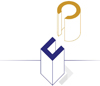
![]() With loving care to not completely change the existing 26 year old logo design, update it to jive with the new look and feel so that the overall effect is an evolution, not a revolution.
With loving care to not completely change the existing 26 year old logo design, update it to jive with the new look and feel so that the overall effect is an evolution, not a revolution.
before…
![]()
after…
![]()
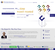
![]() Since scientific, evidence-based search and assessments may not be so well understood by the Target Audience, DMG decided to develop a theme that would communicate the end result. DMG created the theme The Right Fit. The First Time. This, then, became the foundation for the website redesign home page.
Since scientific, evidence-based search and assessments may not be so well understood by the Target Audience, DMG decided to develop a theme that would communicate the end result. DMG created the theme The Right Fit. The First Time. This, then, became the foundation for the website redesign home page.
![]() Given the new corporate identity, positioning line and theme, DMG needed to figure out how to visually communicate “transformative”. Saying a company is “transformative” is easy enough. Visually expressing a sense of being transformative is quite another matter.
Given the new corporate identity, positioning line and theme, DMG needed to figure out how to visually communicate “transformative”. Saying a company is “transformative” is easy enough. Visually expressing a sense of being transformative is quite another matter.
“The site looks terrific!”
“I love the site!”
“The logo demonstrates the concept of ‘fit’ better than existing logo”
“Crisp presentation”
“Can’t get any better than this.”
“I just spent a little time with the website and love it! The copywriting is great, and of course the presentation of it all is beautiful. Nicely done.
The Synergy Organization employees & clients
How Can “Transformative” And “Contemporary” Be Communicated?
DMG’s approach was to create the feeling of Synergy being transformative and contemporary through the combination of a number of elements:
- the combination of 2 particular fonts,
- the introduction of a 2nd color (gold) to the company’s color scheme which previously was simply 1 color (blue)
- creating custom illustrations for visuals rather than relying on stock or even original photography
- the use of lots of white space for a clean, crisp, contemporary look
- visually illustrating on the website home page the square-peg analogy to communicate the The Right Fit. The First Time concept.


Custom illustrations to not only help differentiate, but to help visually
express the transformative and contemporary thoughts while explaining
a multi-faceted concept.
In addition, DMG asked for new, portrait photography of its client’s management team.
And, since there are a lot of PDF white papers and published articles available for download on the Synergy site, DMG installed at the client’s request a lead capture form on all PDF downloads.
Check the Synergy website. In your opinion, does it not visually express transformative and contemporary?